User guide
Quick Start Guide
Case notes
Table component
FAQ
Search
Dashboard
Deleted Documents and Access Log
Solving a task
AI Assistant
Manuals
Substitution and Vacation
Suspending, resuming, archiving and deleting a case
Case variables, history and graph
Basic Terms
Uploading Documents, Folders and Revisions
News
Favorites
Navigating the interface
Dashboard widgets
Case Detail
News/Announcements in Team assistant
Case list
Logging In and Out
Account Settings
Task List
Mobile app settings
Reports and Charts
Searching and Listing Documents
Handing Over, Taking Over and Tasks to Pull
Bulk Tasks
Printing a Case
Creating and Editing an Overview
What Is TAS
Form Fields
Tablet Interface and NFC
Overviews
Creating a New Case
Case Events
Case Permissions
Subscribing to an overview by email
Administrator Guide
Platform guide
Administration
Crons
Authentication and Synchronization
SMTP OAuth authentication
LDAP, SAML, Entra ID and NFC: Settings
Configuring authentication modules
Authentication
Vault
DMS attributes
Service Operations
Mobile App Setup for Your Environment
Scheme
XML Process Import
HR agenda and agenda handover
Logs
Archiving
Scripts
Sequences
System Status
News Management
Migrations
Configuration
Plugins
Email Queue
Service Console
AI monitoring
Shared Files
Settings
CSP Headers
CSV Files
Scheduled Tasks
Processing Queues
Maintenance
Administration Menu
Licenses
Dynamic Tables
Usage Statistics
Access Token Settings & Session Expiration
Visual Identity
Template
Prints
Tasks
Task calculations
Automatic task completion and cancellation
Email Task and Notifications
Task types
Smart Event task
Instructions, Sections and Testing a Task
General task settings and solver
Multi-instance
Planning: start, branching and due date
Dynamic conditions: builder
Variable assignment and sections
Variables
Class diagram, object state import and alias candidates
Document list
Text and Multiline text
Checkbox
Number
Variables: overview and common settings
Lists (texts, numbers, dates)
Dynamic Rows
Date
Dynamic list
Sequence
Dynamic Table
Shredding Process
Template graph
Template Tab
Template List
Importing, Exporting and Copying a Template
Template Headers
Case statuses
Roles
Connecting to a different database
Diagnosing services
Hyper-V: Isolated NAT Network with Port Forwarding
Users
Translations
NFC Integration
Events and Rules
AXIOS API
Plans
Axios with Vault
Users
Axios with SSL Certificate
User Detail
Calculations & Functions
Form condition
Other dynamic conditions
Optimization of API calls on dynamic conditions
Filtering in a dynamic sheet using dynamic conditions
Dynamic Conditions: Script
Dynamic Rows: Script
Calculations
Dynamic Tables
Printing and File Generation
Documents in Calculations — Complete Guide
Printing and File Generation in Calculations
DOCX document creation
Other Calculations
How and when calculations run
Calculations API reference: the lib library
Calculations API reference: variables and case
Global Scripts and React Scripts
Integrations
MS Graph
MS Graph - cron configuration
MS Graph v2 (from v5.7.102)
MS Graph - preparing the mailbox
MS Graph (email)
ISDOC.PDF
DocuSign
TAS call module - TAS 2 TAS (process creation via API)
DB View
DocuSign and electronic signatures
ERP and other integrations
Smart Events for Integrations
TAS Forms
TAS Forms
Activating the module on the environment
TAS Forms - secret creation guide for Docker Swarm
Advanced Features & Tips
Filtering in a dynamic sheet using a URL parameter (static)
Optimizing Overviews with a Large Number of Cases
API Documentation
Product
Technical Changelog
Business Changelog
Version Upgrade Guide
Upgrade to v5.19
Upgrade to TAS 5.19 - Key Changes and Removed Features
Upgrading TAS 5.17 to 5.19 – Technical Part (DevOps)
Upgrate to v5.17
Upgrade to TAS 5.17 - Key Changes and Removed Features
Asset Migration from FE to Backend (5.17 Upgrade) — DevOps
Upgrading to v5.7
Lodash upgrade v4.17.x (>v5.5)
Main changes and deprecated features (v5.3 > v5.7)
Highlighting variables in Read-only status (>v5.7.58)
Upgrading to 5.3
Dynamic conditions migration
PDF printing adjustment
Editing Task Description vs Task Instructions
Transpiling forEach to a for loop
Rendering HTML on Caseoverview
Differences between TAS4 and TAS5 - a complete overview
Best Practices for Upgrading from v4 to v5
Using validation functions
Technical details
Server prerequisites
Security and Data Protection
Security
TAS Operations Runbook
Technological architecture
News / Important information
Microsoft Disabling Basic Auth for SMTP
End of EWS support and transition to Microsoft Graph
Adjustment in EWS after MS Exchange update (29.04.2025)
Security notices
Getting Started
- All Categories /
- Administrator Guide
- Platform guide
- Administration /
- Visual Identity
Visual Identity
Visual Identity lets you match TAS to your corporate branding: the primary color, the logos on the login page, in emails and in the browser tab, and the items of the side menu. Changes apply to all users. The page is available to administrators; open it from the Administration menu using the Visual Identity tile in the Application management and configuration group.
Color scheme
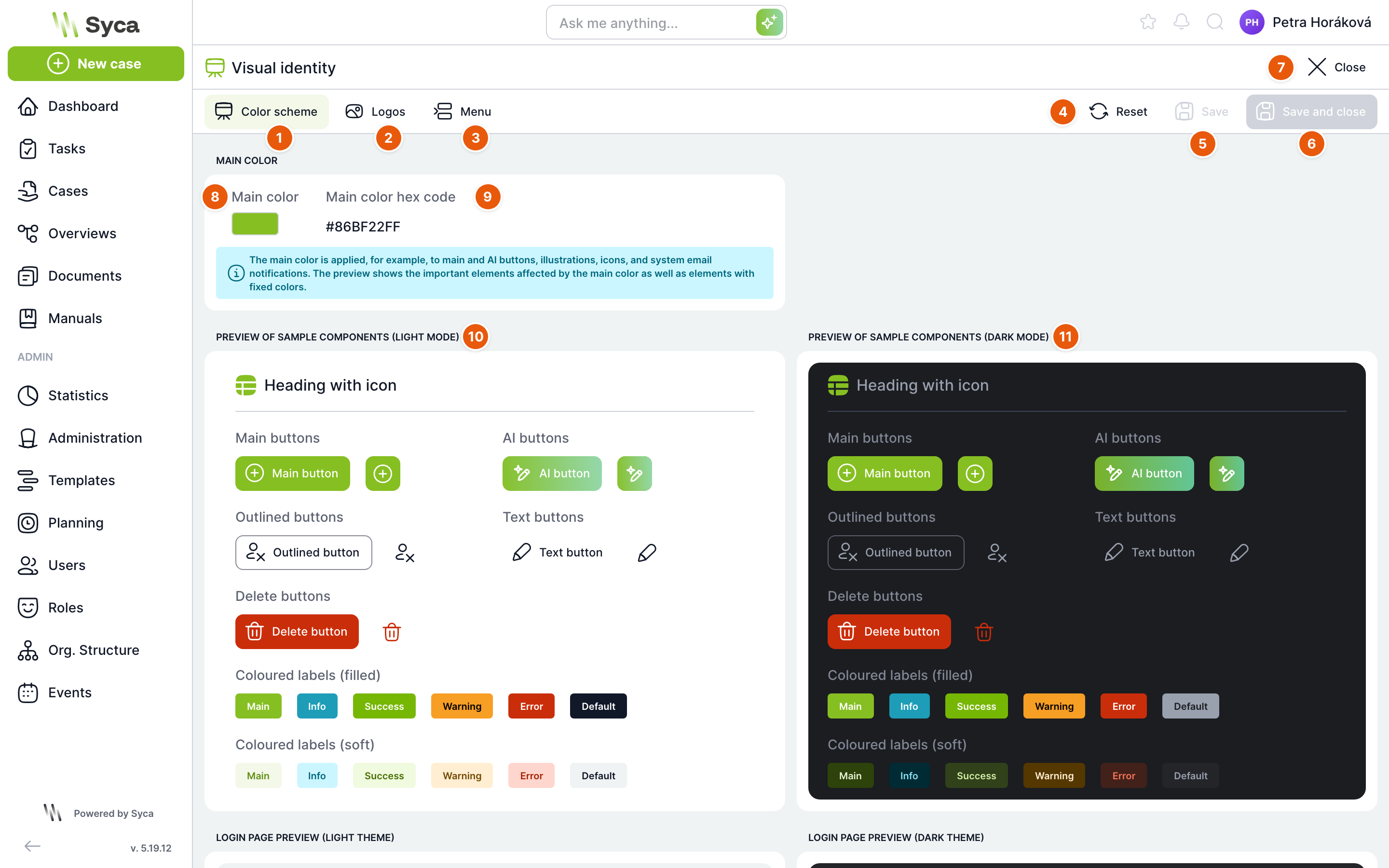
| No. | Element | Purpose |
|---|---|---|
| 1 | Color scheme | Tab with the primary color of the application. |
| 2 | Logos | Tab with the logos. |
| 3 | Menu | Tab with the side menu items. |
| 4 | Reset | Restores the content of the open tab to its default state. Asks for confirmation first. |
| 5 | Save | Saves the changes on the open tab. Active only when you have unsaved changes. |
| 6 | Save and close | Saves the changes and takes you back to the Administration menu. |
| 7 | Close | Takes you back to the Administration menu. |
| 8 | Primary color | Click the color square to open the color picker. |
| 9 | Primary color hex code | Code of the selected color. Read-only. |
| 10 | Sample component preview (light mode) | How buttons, tags and headings will look with the new color in light mode. |
| 11 | Sample component preview (dark mode) | The same in dark mode. |
Below the component previews are previews of the login page in light and dark mode and a preview of an email notification.
The primary color is used, for example, on primary and AI buttons, illustrations, icons and system email notifications. The preview also shows elements with a fixed color that do not change with the primary color, such as delete buttons. Once saved, the new color takes effect throughout the application and in emails. Reset asks Do you really want to reset the colors? and restores the default TAS color.
Logos
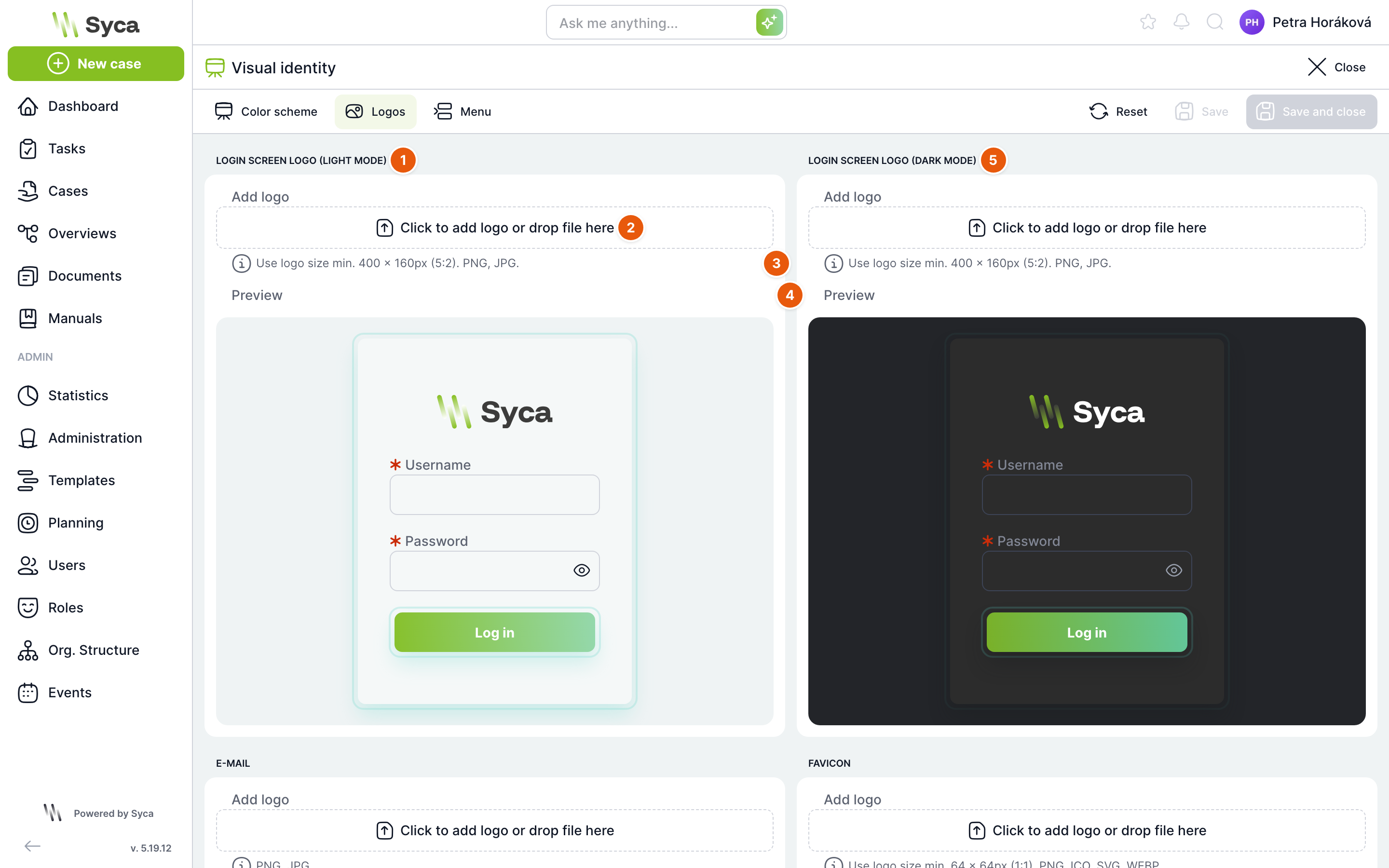
| No. | Element | Purpose |
|---|---|---|
| 1 | Login screen logo (light mode) | Logo on the login page in light mode. |
| 2 | Add logo | Click to select a file, or drag it into the field. |
| 3 | Recommendation | Required format and minimum file dimensions. |
| 4 | Preview | How the login page will look with the logo. |
| 5 | Login screen logo (dark mode) | Logo on the login page in dark mode. |
Below them are the Email and Favicon (browser tab icon) cards with an email preview and a browser tab preview.
| Logo | Format | Dimensions |
|---|---|---|
| Login screen, light and dark mode | PNG, JPG | Cropped to a 5 : 2 ratio, saved as 400 × 160 px. Use an image at least this size. |
| PNG, JPG | Free crop. | |
| Favicon | PNG, JPG, ICO, SVG, WEBP | Square crop, saved as 64 × 64 px. |
How to upload a logo
- On the logo card, click the Add logo field and select a file, or drag it in.
- Set the crop area in the cropping tool. The Delete logo button discards the selection.
- Click Upload, or click Save in the header directly; all logos with a prepared crop are saved.
- To delete an uploaded logo, click the trash icon next to the preview. The application asks Do you really want to delete the logo?.
The application rejects files of any other type with the message Invalid file format. Reset on this tab deletes all four logos and restores the defaults.
Menu
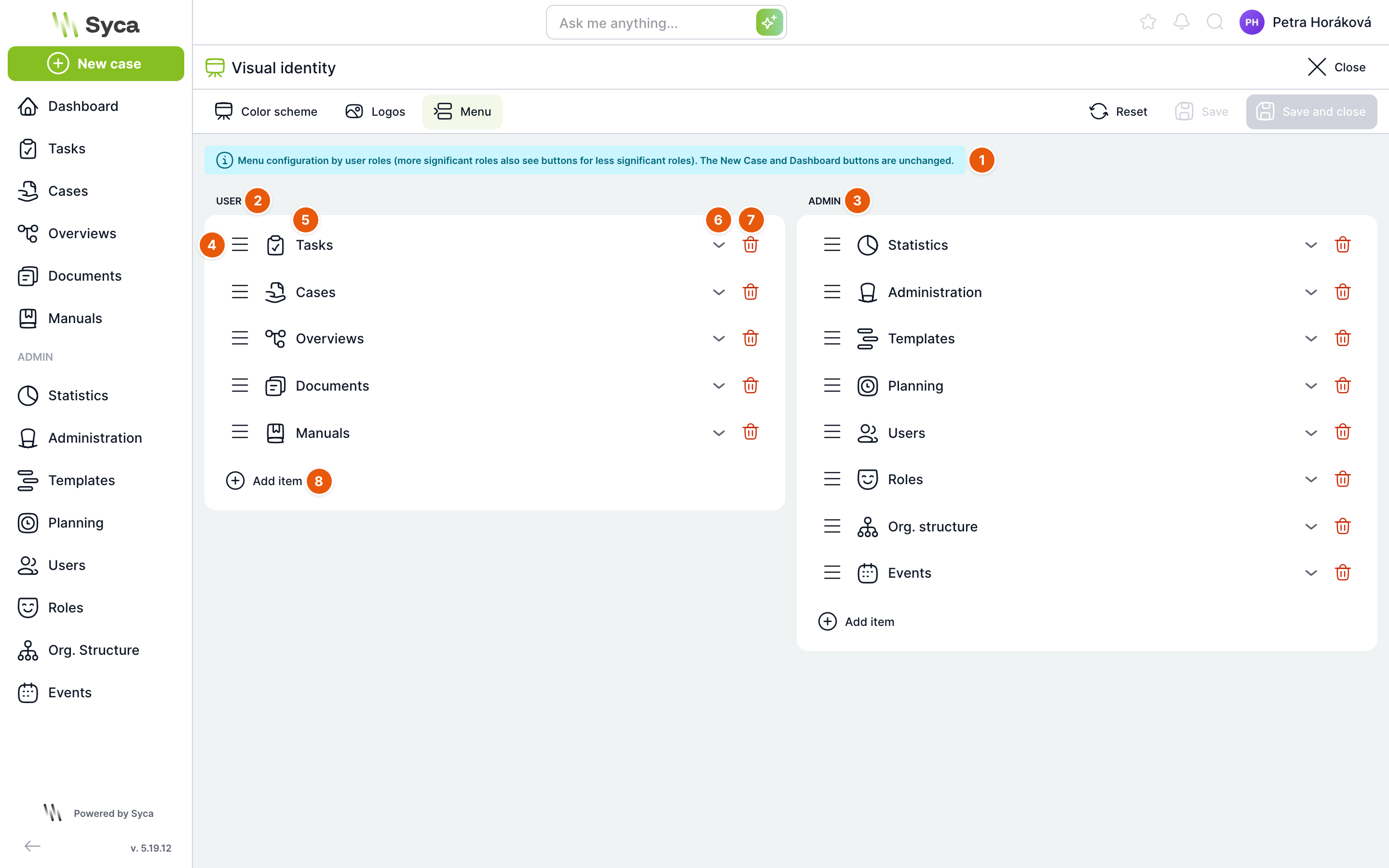
On the Menu tab you edit the side menu items. The New case and Dashboard buttons always stay in place and cannot be changed.
| No. | Element | Purpose |
|---|---|---|
| 1 | Information | A reminder that the menu is configured by role level. |
| 2 | User | Items visible to all users. |
| 3 | Admin | Items for administrators. Displayed in the ADMIN group. |
| 4 | Move | Drag by the icon to change the order of the item within the group. |
| 5 | Icon and name | How the item appears in the menu. Click the row to expand the item. |
| 6 | Expand | Opens the item settings. |
| 7 | Delete | Removes the item from the menu. The application does not ask for confirmation; the change takes effect only after saving. |
| 8 | Add item | Adds a new item to the group. |
There are three levels: User, PowerUser and Admin. A higher level also sees the items of lower levels. An administrator therefore sees the items of all groups, a regular user only the User group.
Item settings
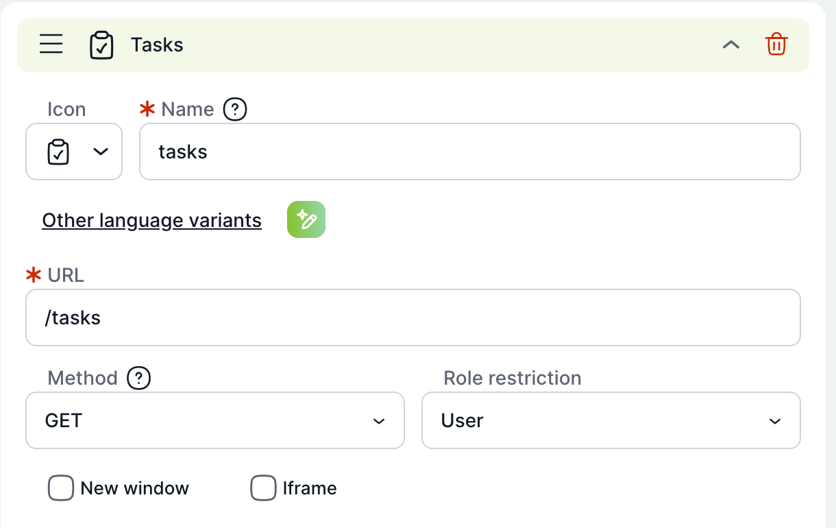
| Field | Purpose |
|---|---|
| Icon | Icon of the item in the menu. |
| Name | Required. Text of the item. For standard items, enter a translation key (for example tasks, cases, overviews) and the name is displayed in the user's language. Custom text is displayed as is, unless you fill in the language variants. |
| Other language variants | Expands a Name field for each language. The AI button next to the link translates the names if AI is enabled. |
| URL | Required. The address the item leads to. Enter internal pages as relative paths, for example /tasks. |
| Method | GET opens the link. POST sends a request with a body to the specified address. |
| Body | Content of the request being sent. Displayed only for the POST method. |
| Role restriction | User, PowerUser or Admin. Changing it moves the item to the corresponding group. |
| New window | The link opens in a new browser tab. |
| Iframe | The page is displayed inside TAS. The address must start with http(s) or /assets/uploads. |
How to add a custom link to the menu
- In the User group, click Add item.
- Select an icon and fill in Name and URL, for example a link to your company intranet.
- If the link should open outside TAS, select New window.
- Click Save. If the name or URL is missing, the application refuses to save and highlights the empty fields.
Reset on this tab asks Do you really want to reset the menu? and restores the default TAS menu.
The switches for hiding Tasks, Cases and Statistics in Configuration apply only to the default menu. Once you save the menu on this tab, the display of items is controlled solely by this setting.
If you switch tabs, close the page or navigate elsewhere with unsaved changes, the application asks whether to save them. Each tab is saved separately.
Related: Configuration, Settings.