Case Overview Builder
The Case Overview is the first tab of the case detail. It shows the most important data, items, documents, approval progress and print preview on a single page. You design its layout in the builder without programming, by putting sections together. The template author (role $Administrator or $Poweruser) opens the builder in the template editor on the Case Overview tab: Templates → template → Case Overview.
Builder
The image shows the overview of the Purchase Order template with the sections Order summary, Order items, Documents, Approval progress and Purchase order form.
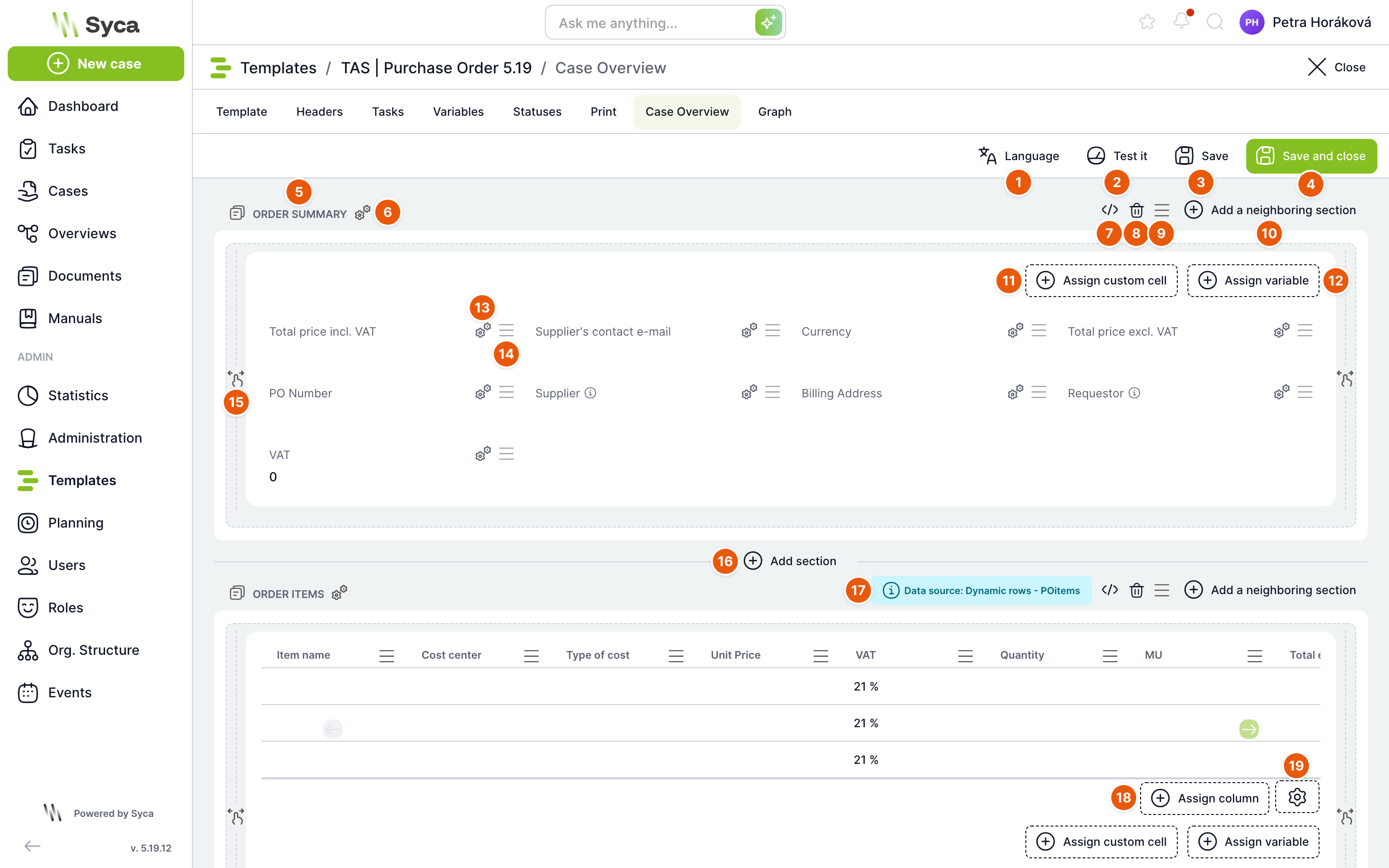
| No. | Element | Purpose |
|---|---|---|
| 1 | Language | Switches the language in which the builder shows section names and variable and column labels. Offers the languages of the installation. This lets you check and complete section names entered in another language. |
| 2 | Test | Opens a selection of cases of this template and shows the overview on the chosen case as the user will see it. Unsaved changes must be saved first, see Testing on a case. |
| 3 | Save | Saves the layout and the settings of all sections and keeps the builder open. Before saving, the JSON of open sections is validated; invalid JSON stops the save and TAS tells you which section contains the error. |
| 4 | Save and close | Saves and returns you to where you opened the builder from. |
| 5 | Section name | Section heading in the currently selected language. A new section is named ENTER A NAME until you change it. |
| 6 | Section settings | The Configuration window with the section name, icon, height and hide condition. |
| 7 | Show JSON | Switches the section to a JSON editor with its complete settings. Clicking again validates the JSON and returns the section to the normal view. The Script section does not have this button. |
| 8 | Delete | Removes the section after confirmation. If variables in another section take data from its table, the window warns you and lists them. |
| 9 | Move | Drag this icon to move the section to another position. |
| 10 | Add adjacent section | For a full-width section, adds a new section next to it; both then take half of the width. |
| 11 | Assign custom cell | Adds a cell whose content you define yourself, for example text, a link or a value calculated from other variables. |
| 12 | Assign variable | Adds a cell with the value of a template variable to the section. |
| 13 | Cell settings | Cell size, type and style, see Cell settings. |
| 14 | Move cell | Drag to change the order of cells. |
| 15 | Resize | Drag the side edge to change the section width (half or full width) and the bottom edge to change its height. |
| 16 | Add section | Adds a new section below this section. For a half-width section the button is called Add adjacent section below. |
| 17 | Data source | For table sections, shows where the table takes its rows from, for example Dynamic rows – POitems. |
| 18 | Assign column | Adds a column to the table. |
| 19 | Table settings | The Configuration – DataGrid window with the table behaviour and appearance. |
The overview has two columns. A section takes either the full width or half of it. On a narrow display, sections are stacked one below another.
If the template contains a print marked as the case overview (a print named CASE OVERVIEW), the builder is greyed out and a red bar at the top reads Case overview is not active, another print is used as Case overview for this template. Users then see this print, not the overview from the builder. To use the builder, delete the CASE OVERVIEW print on the Print tab or clear its Case overview flag.
Section types
Add a section with Add section, Add adjacent section or Add adjacent section below. A menu of types opens.
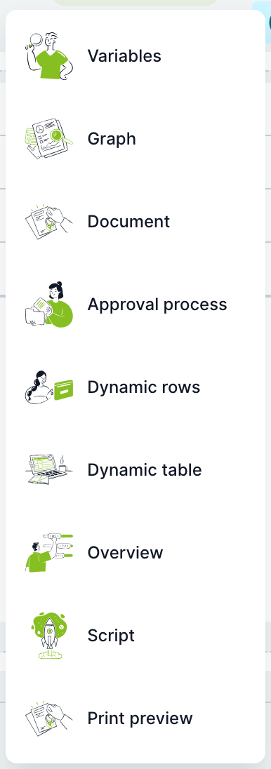
| Section type | What it shows | What you set |
|---|---|---|
| Variables | Cells with case variable values and custom cells. | Variables and cells, their size, type and style. |
| Chart | A bar, line or pie chart over overview data (custom view). | The chart wizard. |
| Document | Case documents with a list and a preview of the selected file. | The appearance of the document list, via the gear icon in the section. |
| Approval process | A table of approval steps: step, responsible person, date, decision and additional information. | Displayed tasks and the variables for the Decision, Additional information and Planned progress columns. |
| Dynamic rows | A table from a dynamic rows variable, for example order items, with totals below it. | After adding, select the dynamic rows variable in the Add dynamic rows window. Then the columns, table settings and the cells below the table. |
| Dynamic table | A table from a dynamic table (Administration → Dynamic tables). | After adding, select the table in the Add Dynamic table window. |
| Overview | A table from an overview (custom view), for example related cases. | After adding, select the overview in the Add overview window. It offers the overviews you have access to. |
| Script | Custom content written in JavaScript (React). | Code in the section editor. |
| Print preview | A rendered print of the case, for example a purchase order form, with an optional Approved / Not approved label. | After adding, select the print in the Add print preview window. Then the approval status settings. |
| NFC Reader | A field for an NFC card reader. | Instruction text. The type is offered only when the tas.nfcReaderEnabled item is enabled in Configuration. |
Section settings
Open the window with the gear icon next to the section name.
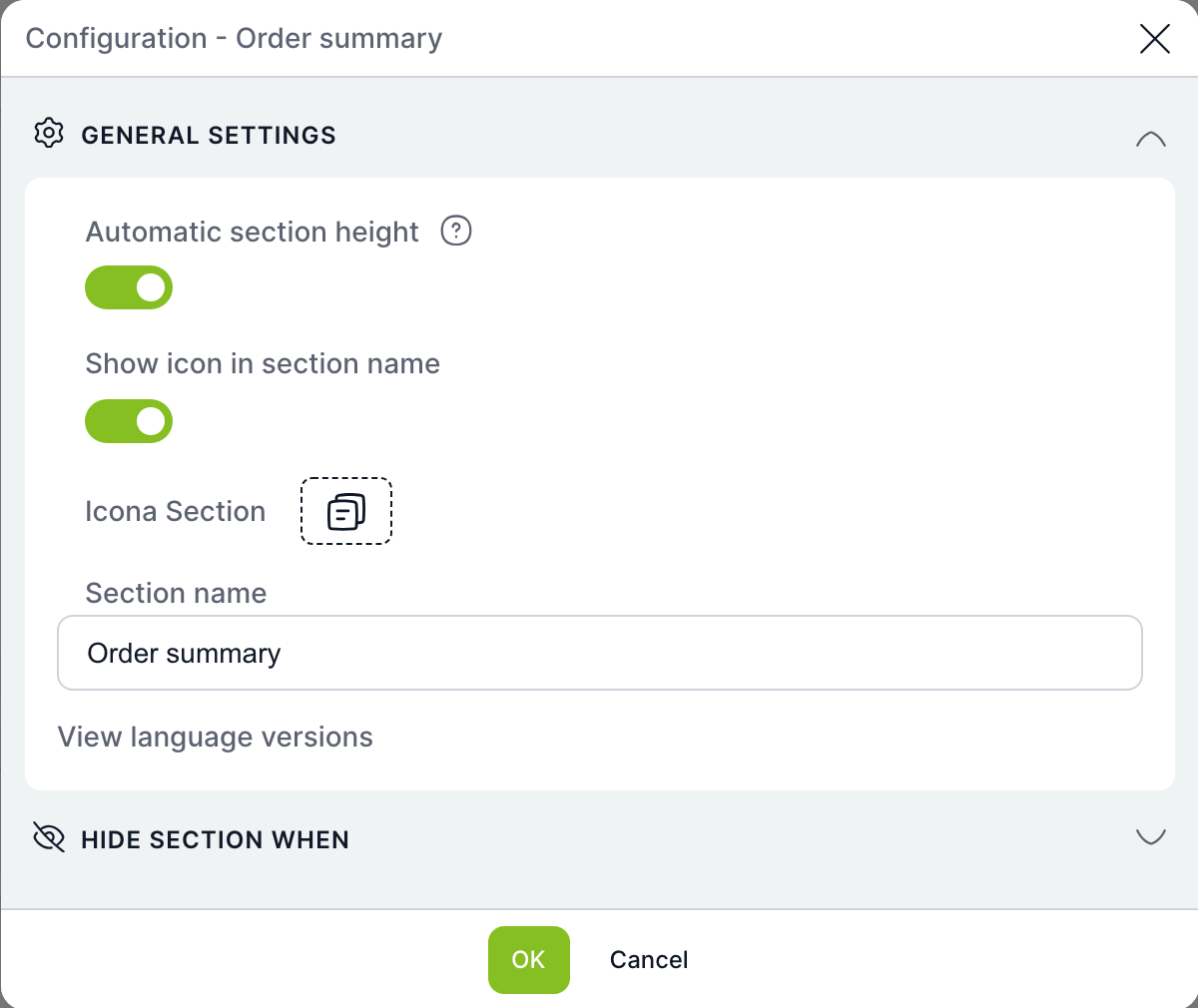
| Field | Purpose |
|---|---|
| Automatic section height | On the case, the section adapts to its content instead of using the fixed height from the builder. Not offered for Chart and Script. |
| Show icon in section name | Shows an icon before the name. |
| Section icon | Icon selection. |
| Section name | Section heading. Show language mutations expands fields for other languages. |
| Hide section when | After enabling Hide section when condition is met, enter a condition on variables. When it is true, the section is not shown on the case. |
| OK / Cancel | Confirms or discards the changes. They are saved to the template only with the Save button in the builder. |
Cell settings
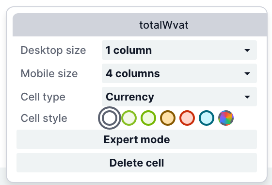
| Field | Purpose |
|---|---|
| Desktop size | How many grid columns the cell takes on a computer. |
| Mobile size | How many columns it takes on a mobile device. |
| Cell type | How the value is displayed, for example Text or Currency. For currency you also specify the currency, for example from a variable. |
| Cell style | Colour highlighting of the cell. |
| Expert mode | A cell value calculated from other variables or from an aggregation of a table column (sum, average and so on), for example the VAT total. |
| Delete cell | Removes the cell from the section. |
Table settings
Table sections (Dynamic rows, Dynamic table, Overview, Approval process) have a gear icon at the bottom right of the table that opens the Configuration – DataGrid window.
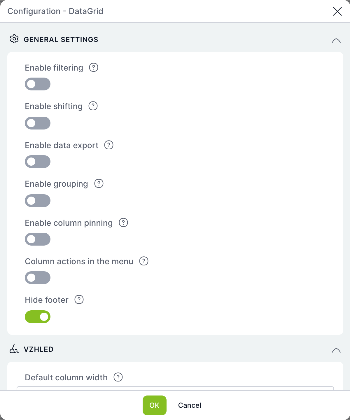
| Field | Purpose |
|---|---|
| Enable filtering | The user can filter the table. |
| Enable sorting | The user can sort by columns. |
| Enable data export | Export is shown in the footer. |
| Enable grouping | Rows can be grouped by a column. |
| Enable column pinning | Columns can be pinned to the left or right. |
| Column actions in menu | Column actions are offered in the header menu. |
| Hide footer | Hides the table footer with the record count. |
| Appearance | Default column width and other table appearance settings. |
You set the order, visibility, width, pinning, grouping and default sorting of columns directly in the table in the builder, using the column header menu; the builder remembers them.
Approval process section
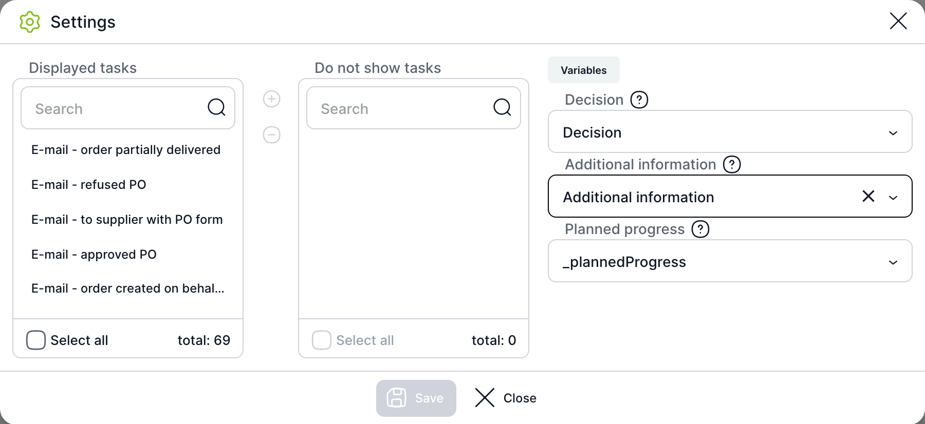
| Field | Purpose |
|---|---|
| Displayed tasks / Hidden tasks | Template tasks that are or are not shown in the progress table. Move them between the lists with the + and − buttons; Select all selects the whole list. You usually hide technical tasks and e-mails. |
| Decision | The variable whose value is shown for the task in the Decision column. It is taken from the history of that task. |
| Additional information | The variable for the Additional information column, also taken from the task history. |
| Planned progress | A dynamic rows variable with the planned approval steps. If you leave it empty, planned steps are not shown. |
Print preview section
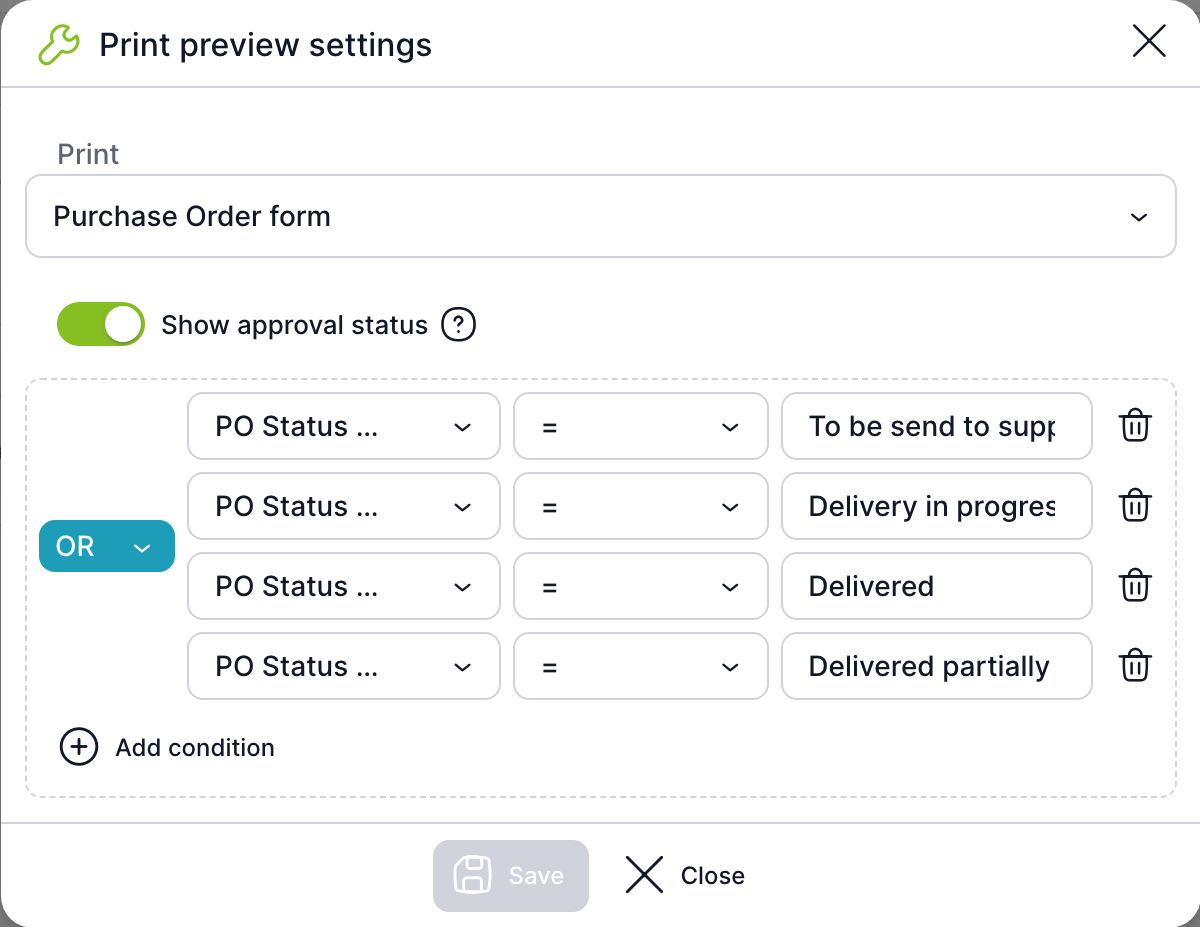
| Field | Purpose |
|---|---|
| The print template of this template that is rendered in the section. | |
| Show approval status | A label is shown above the preview. The default is Not approved; the conditions determine when Approved is shown. |
| Conditions | Variable, operator and value. Combine multiple conditions with the AND / OR switch. Add condition adds a row, the bin icon removes it. |
In the builder, instead of the print, the section shows the text The preview will be displayed on a specific case and the Test button.
Chart section
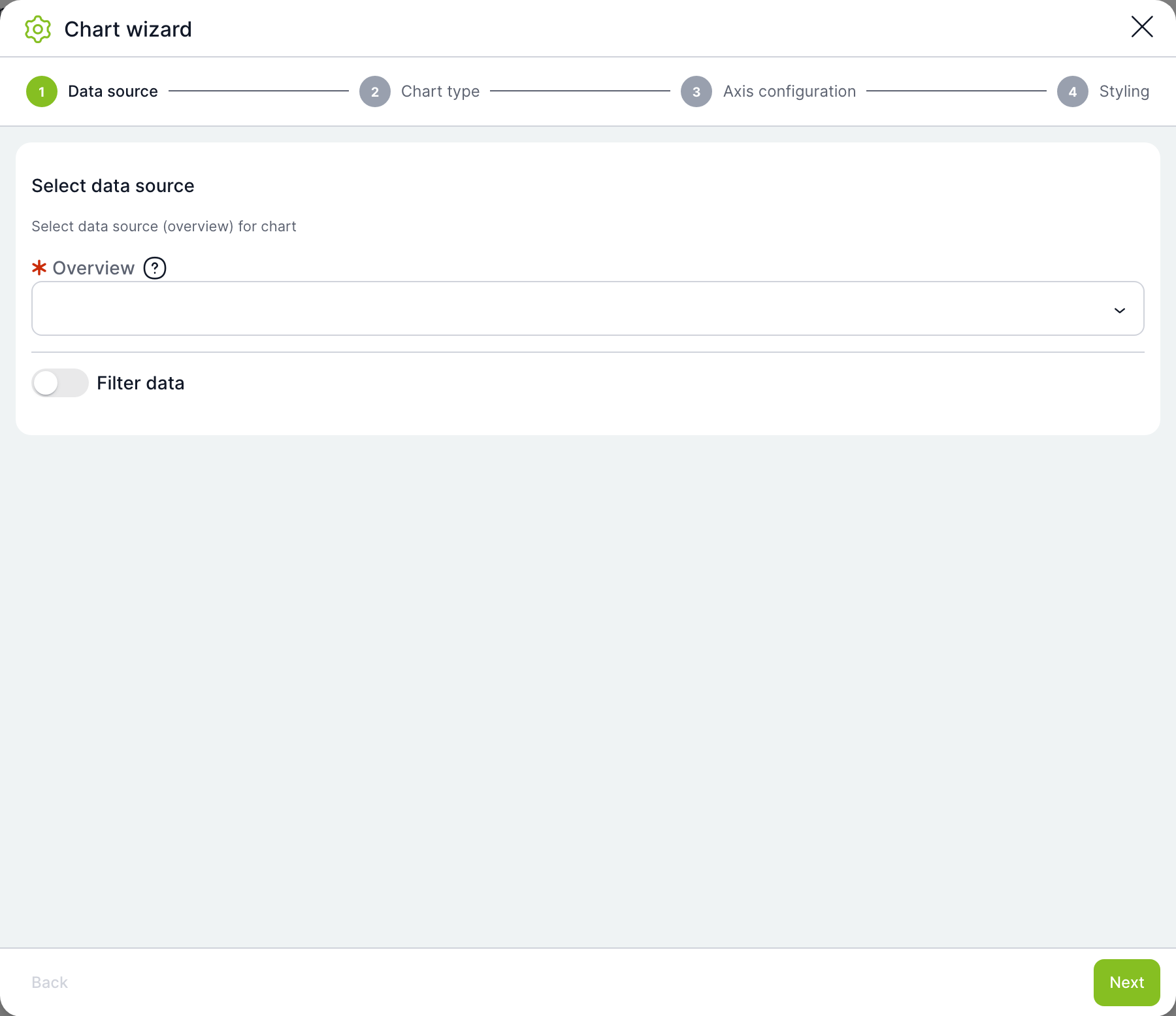
The chart wizard has four steps:
- Data source – the overview (custom view) the chart takes data from. Filter data limits the rows the chart is calculated from.
- Chart type – Bar chart, Line chart or Pie chart.
- Axis configuration – the column for the X axis (categories), the values for the Y axis and the aggregation (sum, average, minimum, maximum, count). For date columns, grouping by day up to year and a date range filter.
- Styling – chart title, colour palette, gradient and legend.
The chart preview is shown in the builder after saving.
Script section
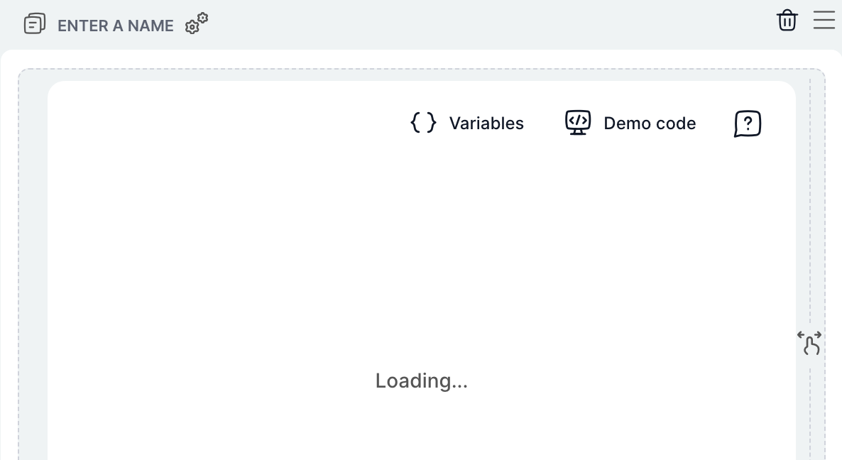
An editor for the section's custom code. Variables inserts getVar('název') for a template variable or a system case variable, Demo code inserts a sample component, and the question mark shows help for the editor.
Show JSON
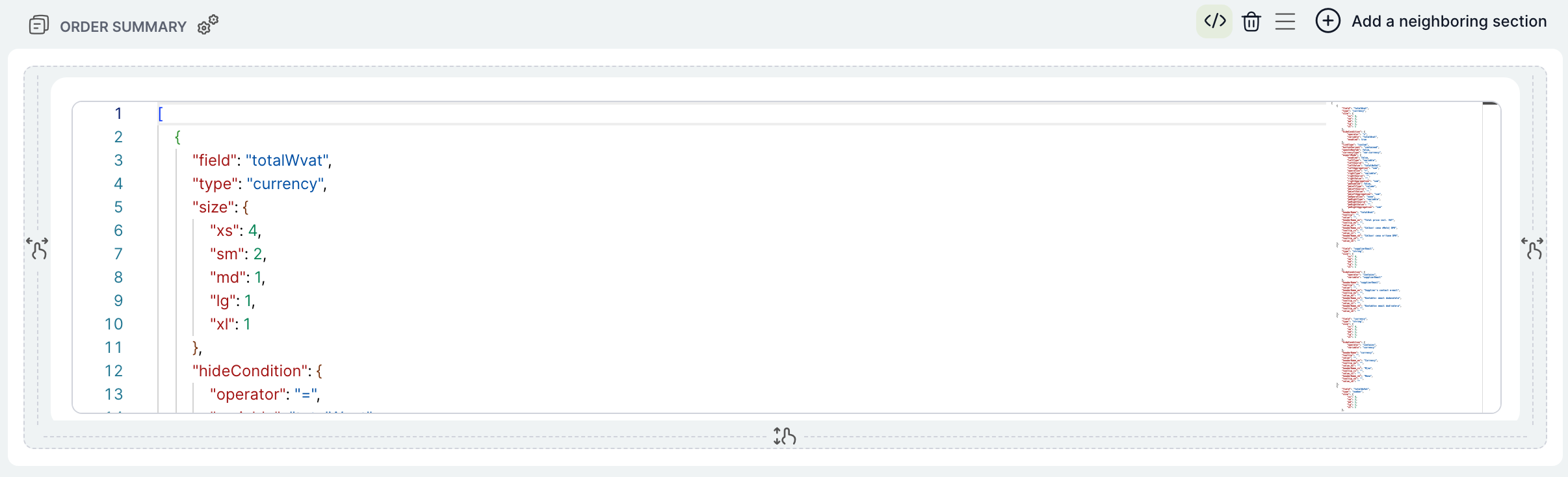
Every section except Script can be shown as JSON. Table sections have two editors: the table settings and the cells below it. JSON is useful for copying settings between templates or for changes the form does not offer. The JSON is validated when you switch back and when you save.
Testing on a case
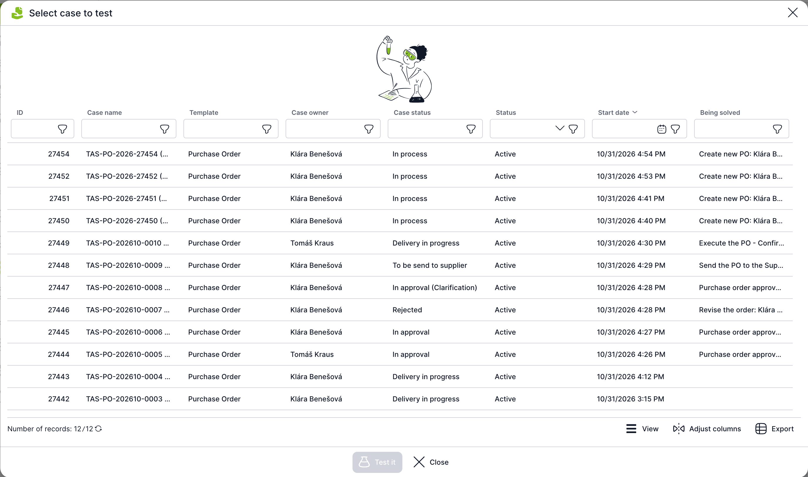
- Click Test. If you have unsaved changes, TAS displays Changes must be saved before testing; click Save to save them.
- In the Select case for testing window, select a case of the template (columns ID, Case name, Template, Case owner, Case state, Status, Date of entry, In progress).
- Click Test or double-click the row.
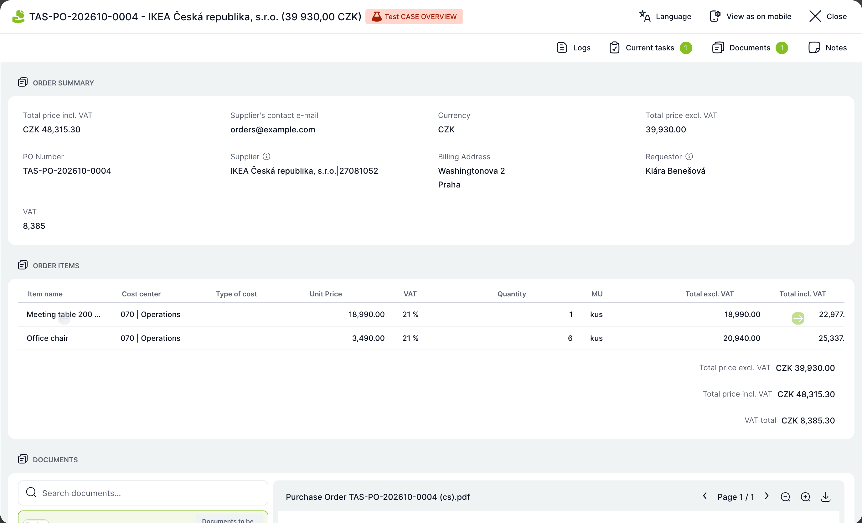
The overview opens in a window labelled Test CASE OVERVIEW. You can switch the language and use Show as on mobile.
How to build a simple overview
An example from the Meeting room booking template: booking details on the left, documents on the right and a preview of the booking confirmation below them.
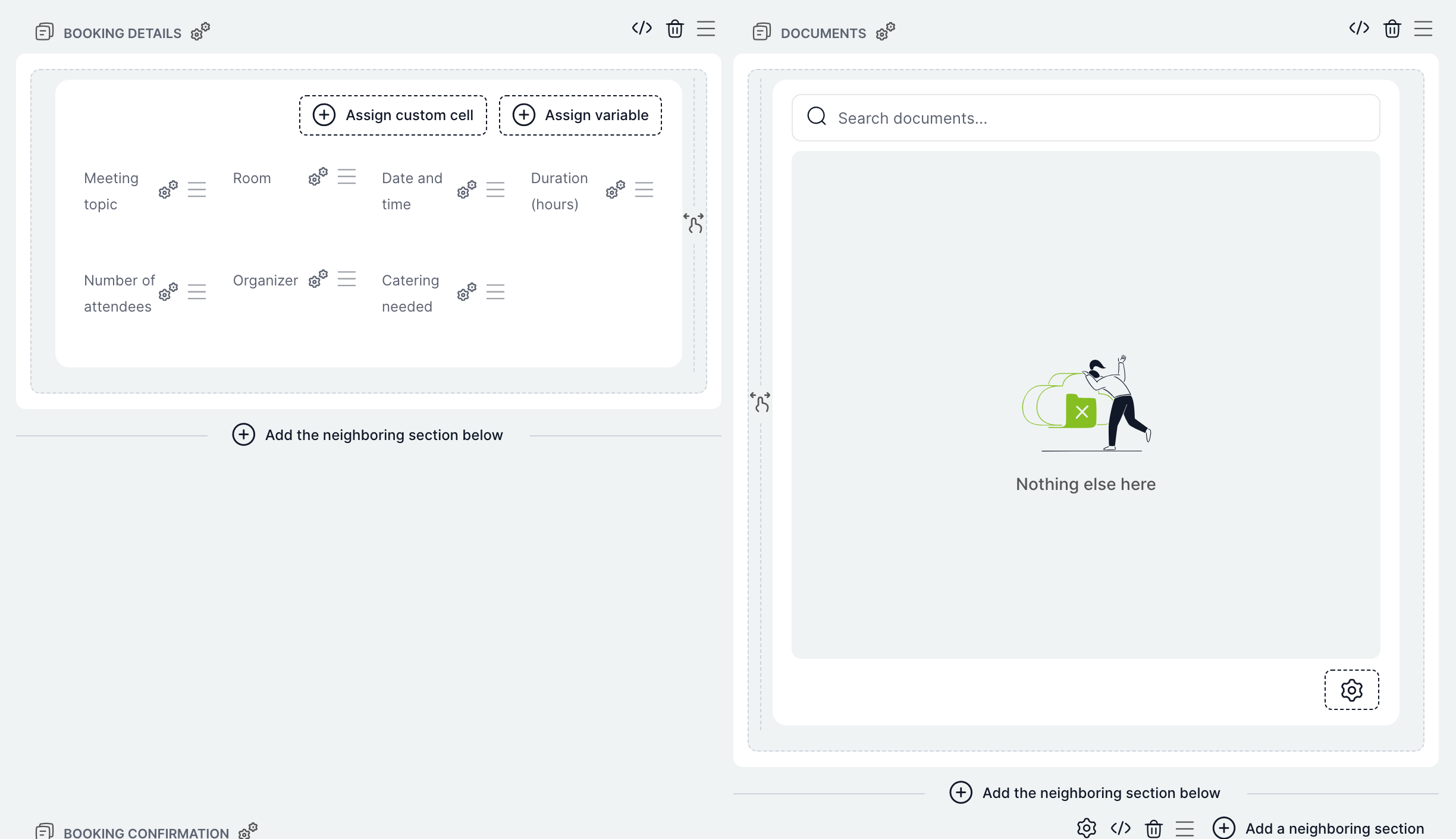
- Open the Case Overview tab. An empty builder offers only Add section.
- Add a Variables section, name it Booking details in the section settings and use Assign variable to add the subject, room, date, duration, number of participants, organiser and refreshments.
- Next to it, add a Document section named Documents.
- Below both, add a Print preview, select the Booking confirmation print and stretch the section to the full width.
- Click Save and try out the overview with the Test button.
Related: Print templates, Case detail, Overviews.