Form Fields
A task form is made up of fields of different types. The template author decides which field types appear in a task, whether they are required and whether you can change them. This article describes how to fill in each field type. The task screen as a whole is described in the article Solving a Task.
Common field elements
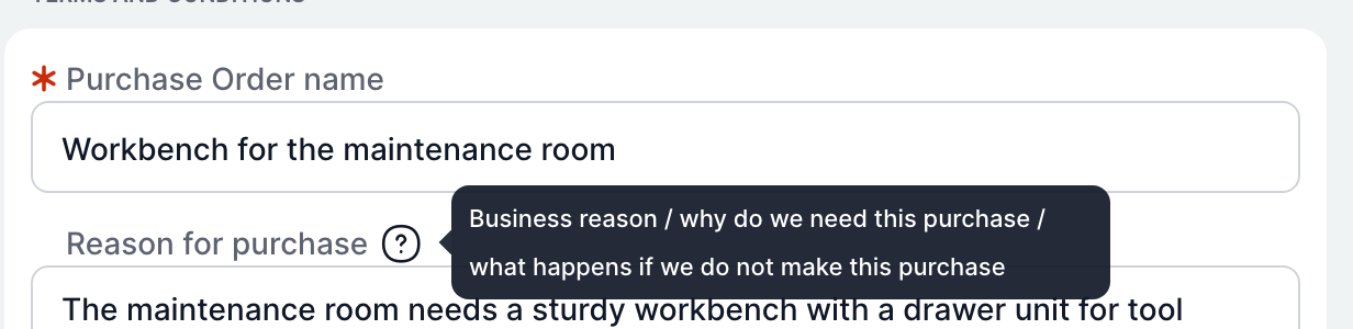
| Element | Meaning |
|---|---|
| Field name | The text above the field. |
| Red asterisk | Required field. You cannot complete the task without filling it in. You can still save a task in progress. |
| Question mark | Help for the field. It appears when you hover the mouse over the question mark. |
| Grey field | Read-only field. You can see the value but cannot change it. |
| Cross in the field | In selection fields, clears the selected value. |
Fields can change while you fill in the form. Based on your answers, the template can hide, show, enable, lock or prefill fields. For example, when you select an existing supplier, the fields for the company ID and VAT number disappear, because TAS already knows them.
Check on completion
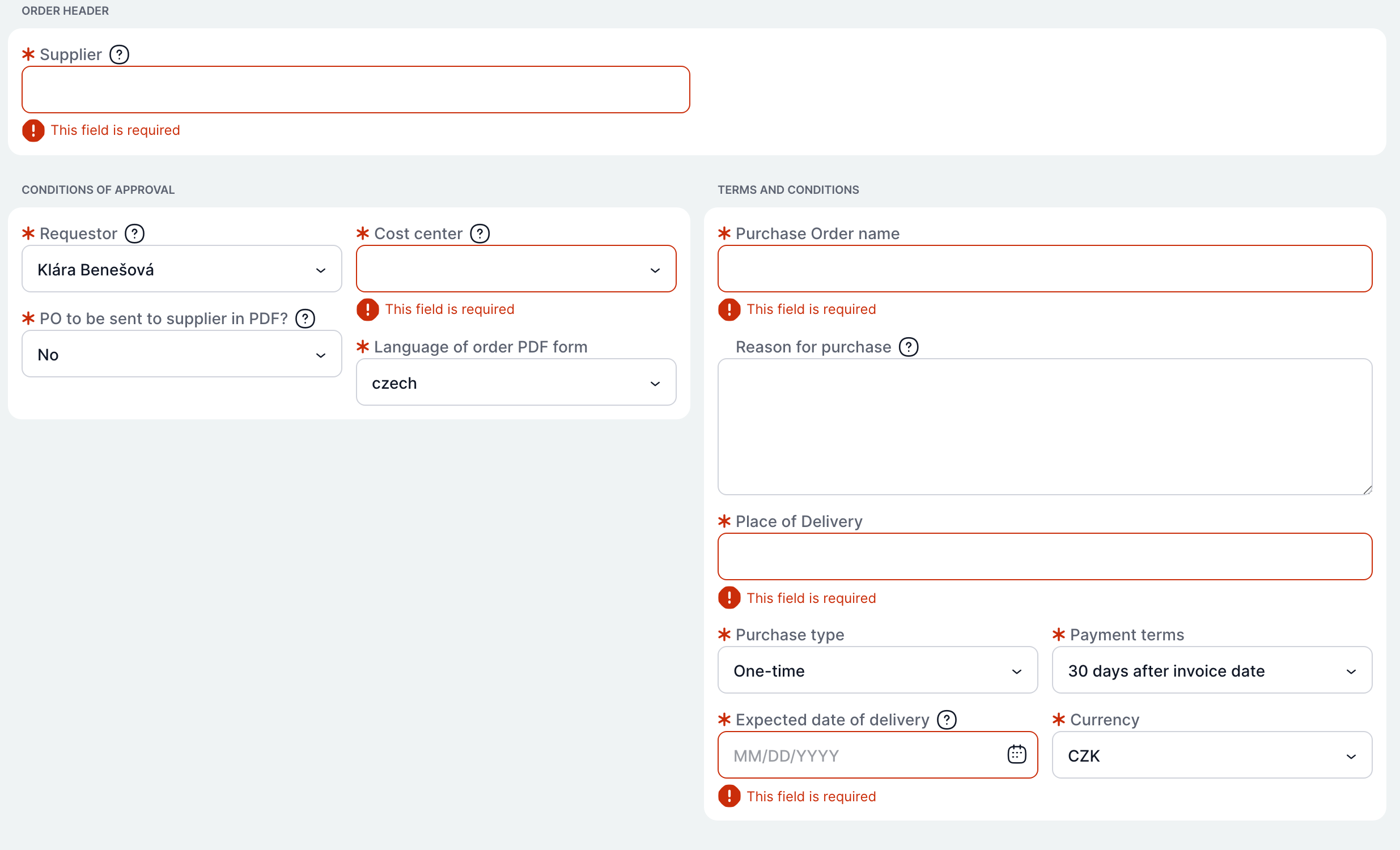
When you click Complete and the form is not valid, TAS does not complete the task and marks the invalid fields in red:
| Message at the field | Meaning | What to do |
|---|---|---|
| Required | A required field is empty. | Fill in the field. |
| Error description from the template | The value does not meet a rule set by the template author, for example an e-mail format or a number range. | Correct the value according to the description. |
At the same time, the message All required data must be filled in to complete the task! or Please fill in the data in the correct format. appears at the bottom. TAS scrolls the page to the first invalid field.
Text
A single-line field for short text, for example an order name. Click in the field and type. The template can restrict the field to digits only or set it as a password field, in which case the typed characters are not displayed.
Multi-line text
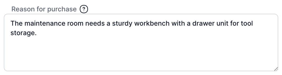
A field for longer text, for example a purchase justification. Pressing Enter inserts a new line. You can resize the field by dragging its bottom right corner.
Text editor
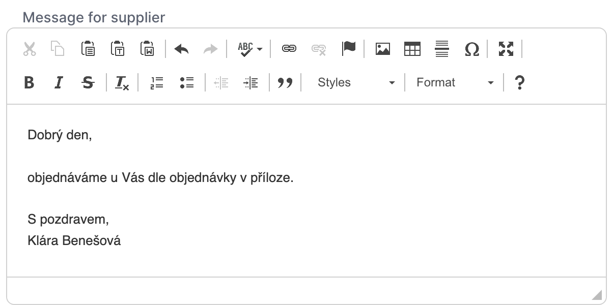
A multi-line field with formatting, for example the text of an e-mail to a supplier. The toolbar offers:
| Group | What it does |
|---|---|
| Clipboard | Cut, copy, paste, paste as plain text, paste from Word. |
| Undo and redo | Reverts or repeats the last change. |
| Spell check | Turns on spell checking as you type. |
| Links | Inserts or removes a link, inserts an anchor. |
| Insert | Image, table, horizontal line, special character. |
| Full screen | Expands the editor to the full screen. |
| Font | Bold, italic, strikethrough, remove formatting. |
| Paragraph | Numbered and bulleted list, indentation, quote. |
| Styles and Format | Predefined text styles and headings. |
| Question mark | Help for the editor. |
The editor is available only where the template author has enabled it. The author also chooses whether the editor has a basic or an extended toolbar.
Number
A field for a numeric value. The template sets the number of decimal places, and the value is formatted to that number of places when you leave the field. If you type anything other than a number, the field is marked as invalid on completion.
Date and time
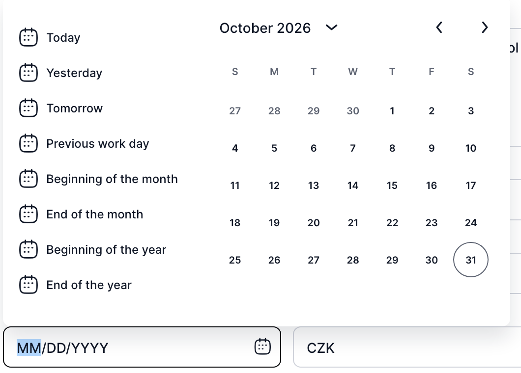
You can type the date directly into the field in the format shown in the empty field, or select it in the calendar after clicking the calendar icon.
| Calendar part | What it is for |
|---|---|
| Quick options on the left | Today, Yesterday, Tomorrow, Previous working day, Start of month, End of month, Start of year, End of year. |
| Month and year | The arrow next to the month name switches to year selection. The arrows on the right move between months. |
| Days | Click to select a day. Today is circled. |
Depending on the template settings, the field can also include time, and it can allow only future dates, only working days or a selected range. Days that are not allowed are inactive in the calendar.
Checkbox
A field with a checkbox. Click it to select or clear it.
Selection from a list
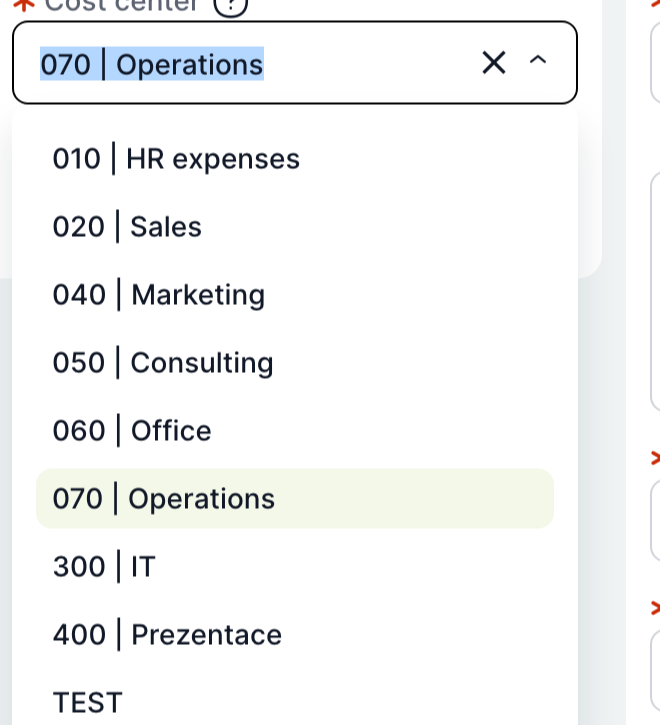
A field with an arrow on the right. Click it to open the list of options and select one. When you start typing, the list narrows down to matching items. This applies to:
- lists of fixed values prepared by the template author (for example Purchase type),
- selection of a user, role or organizational unit,
- selection from a dynamic table managed by the administrator (for example Cost centre or Currency).
In long lists, more items load when you scroll to the end of the list.
Suggest field
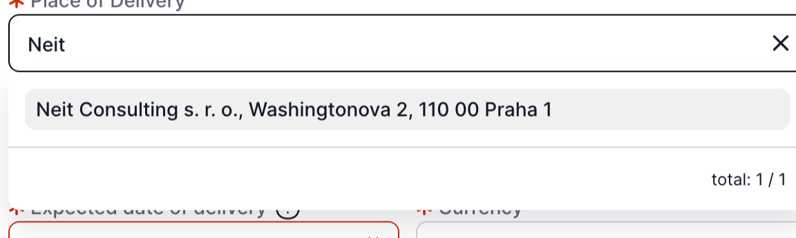
A text field that suggests matching values as you type, for example a supplier or delivery location. Start typing and select one of the suggested items. Below the suggestions you can see how many items match.
Multiple value selection
A field in which you select several values at once, for example several users. Depending on the template settings, it takes one of two forms:
- Drop-down list with multiple values. Works like selection from a list, but the list does not close after you select a value, and the selected values are shown side by side in the field.
- Two lists side by side. Available values are on the left, the Assigned list is on the right. Select values by checking them and move them to the right with the plus button, or back with the minus button. You can also move values by dragging them with the mouse. Each list has a Search field and a Select all option.
Table with rows

A table to which you add rows, for example order items. Each column is filled in as a separate field (text, number, selection from a list). A red asterisk next to a column name marks a required column.
| Element | What it is for |
|---|---|
| Row number | The order of the row. When you hover over the row, it changes into a handle you can use to drag the row to another position. |
| Grey cells | Calculated values, for example the total price. You do not fill them in. |
| Duplicate row | Icon at the end of the row. Inserts a copy of the row. |
| Delete row | Bin icon at the end of the row. |
| Add | Plus icon below the table. Adds an empty row. |
| Totals | A row below the table with totals of selected columns. |
If the template allows deleting all rows, the table header also contains the Remove all rows bin icon. TAS asks for confirmation before deleting. On mobile phones and tablets, row actions (Move up, Move down, Duplicate row, Delete row) are in the menu at the beginning of the row.
On completion, TAS also checks the table rows. It marks an invalid cell and scrolls the page to it.
Documents in a field
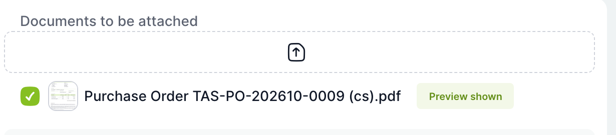
A field for selecting or uploading documents, for example documents to be sent to a supplier.
| Element | What it is for |
|---|---|
| Area with an arrow | Click to select a file from your computer. You can also drag a file into it. The uploaded file is saved among the case documents. |
| Checkbox next to a document | Select it to include the document in the field. |
| Preview | If the template allows it, a preview of the selected document is shown below the field. The Preview shown label indicates which document you are currently viewing. |
In a read-only field you can see the selected documents, but you cannot change them or upload new ones.
Read-only fields

Grey fields without a border only display a value entered earlier by someone else or calculated by TAS. You cannot type into the field. For a user, role or organizational unit selection, the field shows the name; for a text editor, it shows the formatted text. The template can also insert an information block into the form, for example a table with the approval history.
Related: Solving a Task, Task List.