Print Templates
A print template defines how a printed case looks, for example a purchase order form for a supplier, a booking confirmation or a report. Users select it in the case detail under More → Print. A print can also be displayed in the Print Preview section of the case overview. The template author (role $Administrator or $Poweruser) manages print templates in the template editor on the Print tab: Templates → template → Print.
List of print templates
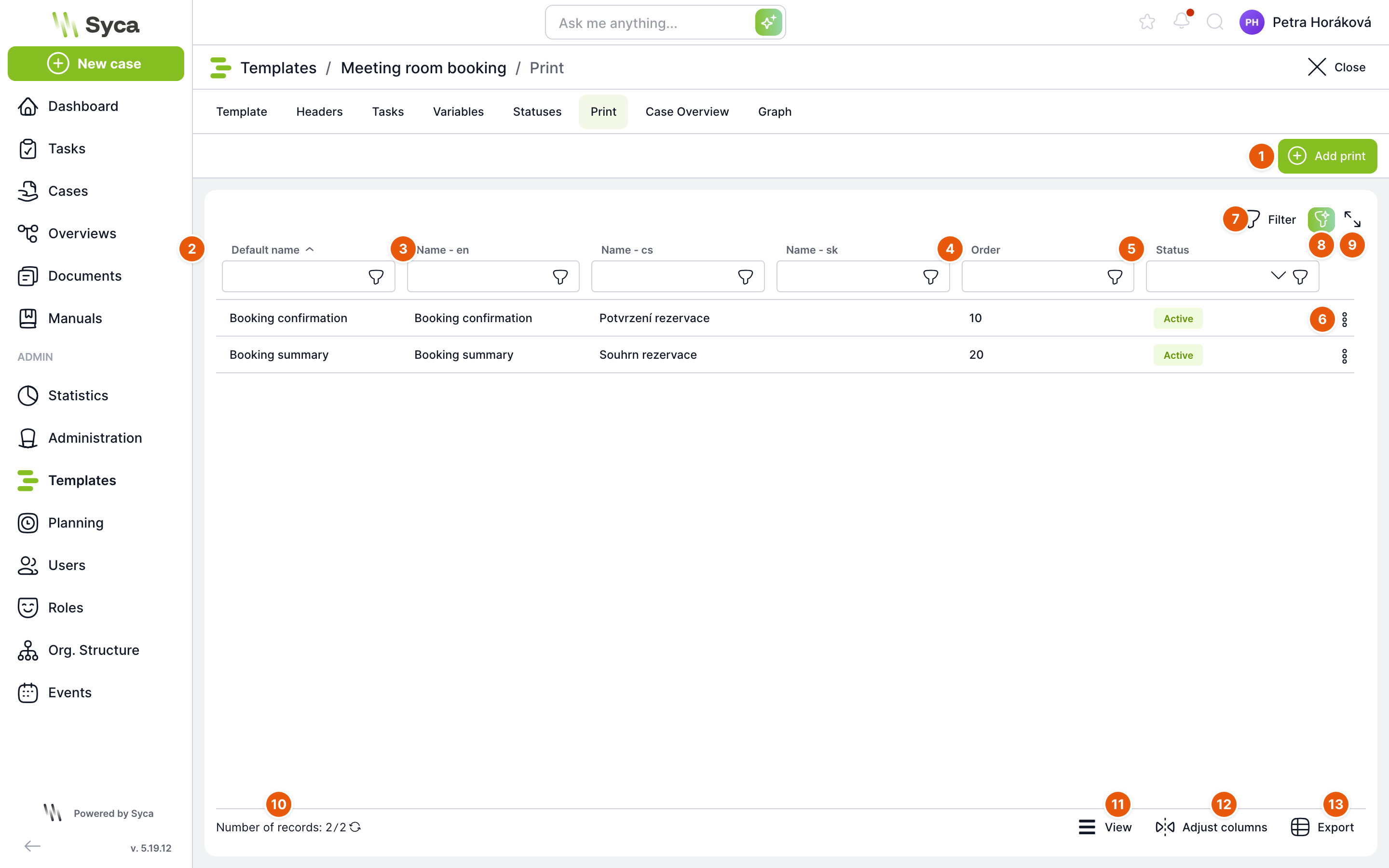
| No. | Element | Purpose |
|---|---|---|
| 1 | Add print | Opens an empty form for a new print template. |
| 2 | Default name | The print name that users see when no translation exists for their language. By default, the list is sorted by this column. |
| 3 | Name – language | One column with the translated print name for each language of the installation (en, cs and sk in the example). |
| 4 | Order | The position of the print in the Print template menu in the Print window. Prints with lower numbers appear higher. |
| 5 | Status | Active or In development. Only administrators and Power users can see a print that is in development in the Print window. Other users cannot. |
| 6 | Row actions | Edit opens the print detail (double-clicking the row does the same). Delete removes the print after you confirm. You can also delete a print by pressing the Delete key on the selected row. |
| 7 | Filter | Advanced table filter. |
| 8 | AI filter | Describe the filter in your own words and AI sets it up. Available only in installations with AI enabled. |
| 9 | Full screen | Expands the table to fill the whole screen. |
| 10 | Record count | The number of prints in the template. The arrow next to it reloads the list. |
| 11 | View | Row density: compact, standard or comfortable. |
| 12 | Fit columns | Resets column widths to their defaults. |
| 13 | Export | Downloads the table to a file. |
Two types of print
| Type | How it is written | When to use it |
|---|---|---|
| Print (standard) | You design the content as a document in a text editor. To insert variable values, write {název proměnné}. When the print is generated, the value from the case replaces it. You can also add JavaScript. | Simple documents: case summary, confirmation, delivery note. |
| Print – React | The print is a React component written in JavaScript (JSX) with its own HTML and CSS. It reads values with the getVar('název proměnné') function and can fetch data through the API. | Complex forms with tables, calculations, conditional content or charts, such as a purchase order form. |
Use the Print / Print – React toggle in the print detail to switch the type. Switching clears the selection in the Loaded scripts field because each print type uses a different group of scripts.
React print detail
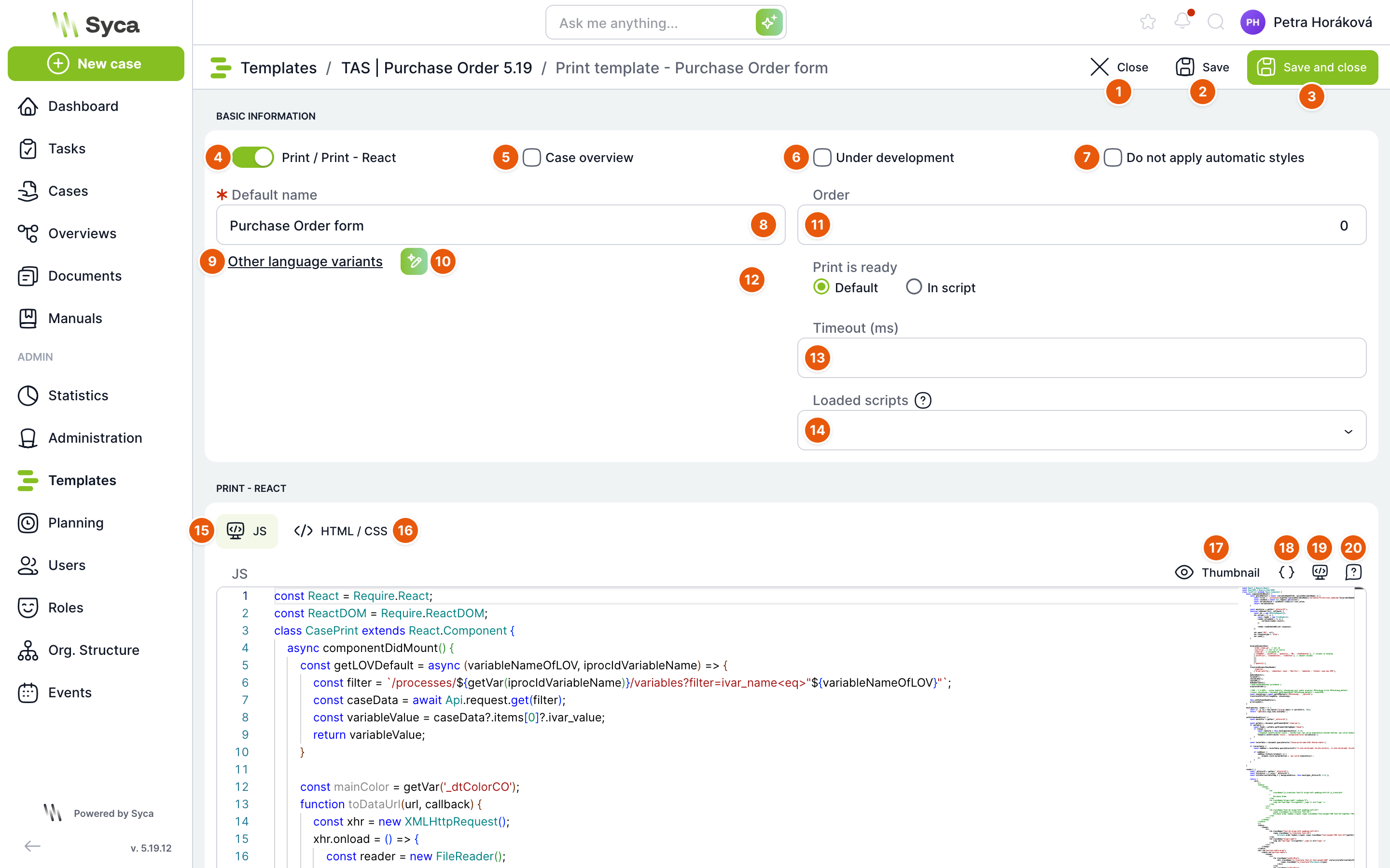
To open the detail, use the Edit action or double-click the row. The screenshot shows the purchase order form of the Purchase Order template.
| No. | Element | Purpose |
|---|---|---|
| 1 | Close | Returns you to the list of prints. If there are unsaved changes, TAS offers to save them. |
| 2 | Save | Saves the print and keeps the detail open. For a new print, the address changes to the address of the saved print after saving. |
| 3 | Save and close | Saves the print and returns you to the list. |
| 4 | Print / Print – React | Toggles the print type. On = React print. |
| 5 | Case Overview | Marks the print as the case overview. The Default name field is replaced with the reserved name CASE OVERVIEW and the name translations are hidden. The print is then displayed on the case overview tab instead of the overview from the builder. Clearing the checkbox restores the original name. |
| 6 | In development | The print has the In development status. Regular users cannot see it in the Print window. Administrators and Power users can. |
| 7 | Do not apply automatic styles | The default TAS styles are not added to the print, so the print looks only as your HTML and CSS define it. This option is not shown for a print marked as the case overview. |
| 8 | Default name | Required. The print name for languages without a translation. |
| 9 | More language variants | Expands a Name (language) field for each language of the installation. ...show less hides them again. |
| 10 | AI translation | Translates the default name into the other languages and fills in the translation fields. Available only when the default name is filled in. |
| 11 | Order | An integer that sets the position of the print in the Print window menu. |
| 12 | Print is ready | React prints only. Default means the print is ready as soon as it is rendered. In script means your script reports when rendering is complete, for example after data queries finish. Only then is the PDF or HTML generated. |
| 13 | Timeout (ms) | The number of milliseconds after the page loads before the browser print dialog opens. Useful when the print needs time to load data. This field is not shown for a React print with the In script option. |
| 14 | Loaded scripts | Selects which scripts from Administration → Scripts are loaded with the print. Only active scripts are offered: CO scripts for a standard print, plus CO React scripts for a React print. If you select none, all of them are loaded. |
| 15 | JS | Tab with the JavaScript editor of the React print. |
| 16 | HTML / CSS | Tab with two editors: HTML (page skeleton) and CSS (print styles). |
| 17 | Preview | Opens a print preview in a window. See below. |
| 18 | Insert variable | List of template variables and case system variables. Click a variable to insert getVar('název') at the cursor position. |
| 19 | Insert snippet | Ready-made code snippets: the CASE PRINT component skeleton (with or without a store), a calendar, an API call, and loading libraries and form components. |
| 20 | Help | Editor tip: Ctrl + Space shows autocomplete, pressing it again shows more detailed help, and F1 shows a list of all commands and shortcuts. Also links to the lodash library documentation. |
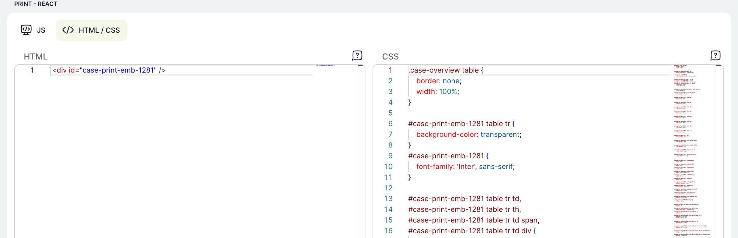
The HTML / CSS tab shows the HTML and CSS editors side by side. Both have the same editor help as the JS editor.
Insert variable and snippet
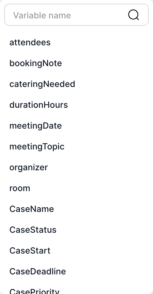
The Insert variable menu first lists the template variables in alphabetical order (system names, for example meetingTopic), followed by the case system variables: CaseName, CaseStatus, CaseStart, CaseDeadline, CasePriority, CasePriorityText, CaseDescription, CaseOwner, CaseOwnerName, CaseNotes, CaseLink and CaseVisRoleId. The field at the top filters the list.
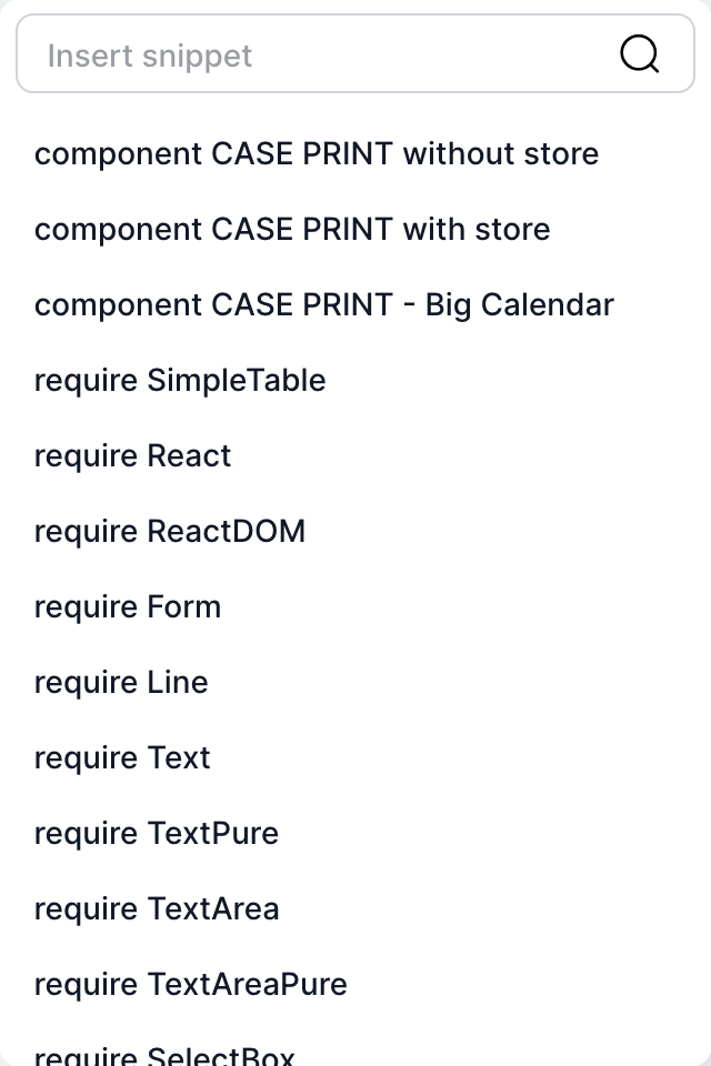
React print preview
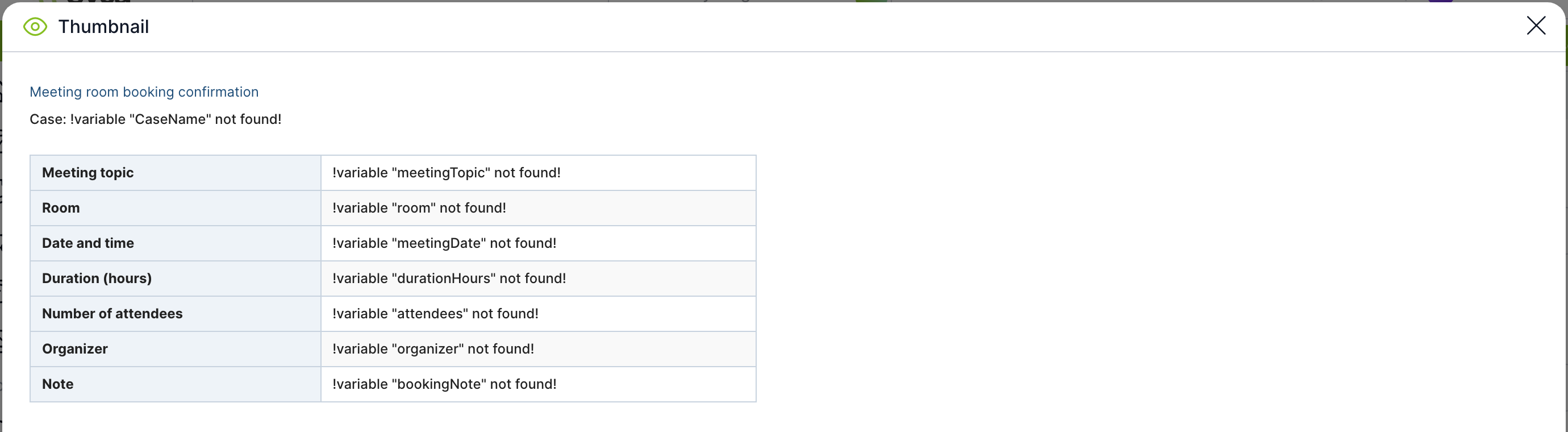
Preview renders the print from the current content of the editors, including unsaved changes. The code is first converted from JSX to plain JavaScript. If it contains a syntax error, the preview does not open and TAS shows a message with the position of the error. The preview has no case data, so getVar(...) returns placeholder text instead of values. You will see real data when you print from a case or test the print in the Print Preview section of the case overview builder.
Standard print detail
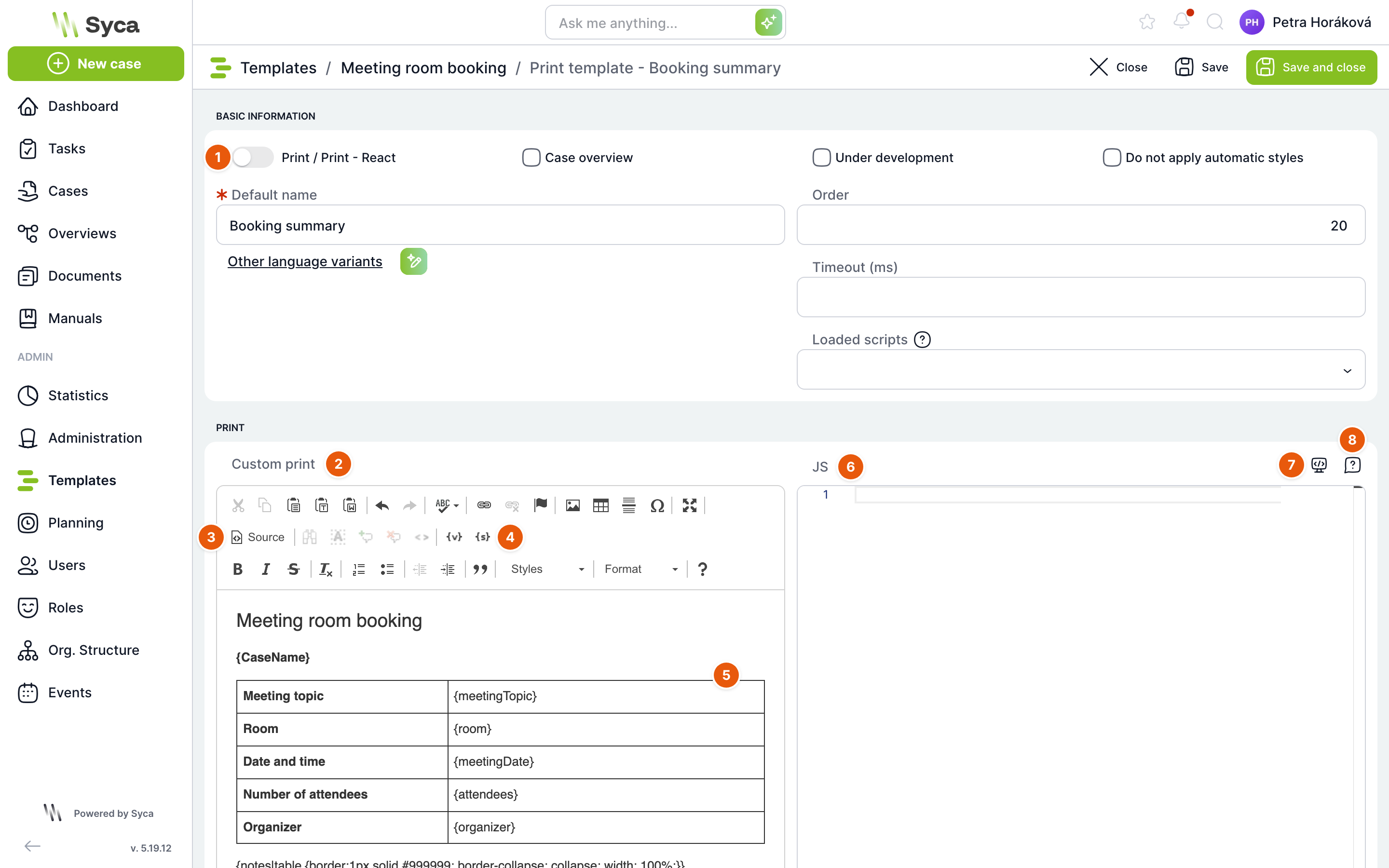
| No. | Element | Purpose |
|---|---|---|
| 1 | Print / Print – React | Toggle off = standard print. The Print is ready field is not shown for a standard print. Timeout (ms) is shown. |
| 2 | Custom print | Text editor for the content. Format it as in a word processor: fonts, paragraphs, lists, tables, images, links, styles. |
| 3 | Source | Switches the editor to source HTML so you can edit the content directly. |
| 4 | {v} and {s} | {v} opens the Insert variable window and inserts the {název} of a template variable or a system variable (task data such as TaskName, TaskOwnerName and TaskLink, and case data such as CaseName, CaseOwnerName, CaseLink and FrontendLink). {s} opens the Insert snippet window with ready-made blocks: {overview:…} overview table, {notes} case notes, {history} history, {attachments} documents and {css:…} custom styles. |
| 5 | Content | The print text. When the print is generated, expressions in curly brackets are replaced with values from the case. |
| 6 | JS | JavaScript editor. The code runs when the print is displayed. |
| 7 | Insert snippet | Snippets for the print JavaScript, for example an API call. |
| 8 | Help | Editor tip: Ctrl + Space, F1 and a link to the documentation. |
A standard print has no Preview button. To test it, print it from a case.
How to create a React print
These steps use the Booking confirmation print in the sample Meeting room booking template.
- In the template editor, open the Print tab and click Add print.
- Turn on the Print / Print – React toggle.
- Fill in the Default name, for example Booking confirmation. Add translations under More language variants, or use the AI translation button to fill them in.
- In the Order field, enter the position, for example 10.
- On the JS tab, use Insert snippet to insert the
component CASE PRINT without storeskeleton. Add content to therender()method and insert values with Insert variable. - On the HTML / CSS tab, add styles, for example for the table.
- Click Preview and check the layout.
- Keep In development selected while you are fine-tuning the print. To publish the finished print, clear In development and click Save and close.
If the template contains a print marked as Case Overview (named CASE OVERVIEW), this print is used on the case overview tab and the overview designed in the builder is not shown. The builder shows a red bar to warn you about this. To use the builder instead, delete the CASE OVERVIEW print or clear its Case Overview flag.
A regular user sees only the active prints of the template of their case in the Print window. Administrators and Power users also see prints in development, so they can test them on real cases without other users seeing them.
Related: Case print, Case Overview builder, Scripts.