User guide
Quick Start Guide
Dashboard
Overviews
Case detail (Caseoverview)
Case - event
Tasks
Case notes
Documents
User settings
Favorites
Table component
FAQ
News/Announcements in Team assistant
Mobile app settings
Administrator Guide
Platform guide
Administration
Crons
Authentication and Synchronization
Mobile App Setup for Your Environment
Scheme
Dynamic tables
Archiving
Scripts
Service console
Scheduled Tasks
HR Agenda
Sequences
CSP Headers
Logs
Access Token Settings & Session Expiration
Template
Roles
Planning
Users
Organizational structure
Events
Translations
NFC Integration
AXIOS API
Calculations & Functions
Integrations
TAS Forms
TAS Forms
Activating the module on the environment
TAS Forms - secret creation guide for Docker Swarm
Advanced Features & Tips
Product
Technical Changelog
Business Changelog
Version Upgrade Guide
Upgrading to 5.7
Lodash upgrade v4.17.x (>v5.5)
Main changes and deprecated features (v5.3 > v5.7)
Highlighting variables in Read-only status (>v5.7.58)
Using validation functions
Upgrading to 5.3
Dynamic conditions migration
PDF printing adjustment
Editing Task Description vs Task Instructions
Transpiling forEach to a for loop
Rendering HTML on Caseoverview
Differences between TAS4 and TAS5 - a complete overview
Best Practices for Upgrading from v4 to v5
Technical details
News / Important information
Getting Started
- All Categories /
- Administrator Guide
- Platform guide
- Template
- Prints
- Components /
- DataGrid Tanstack
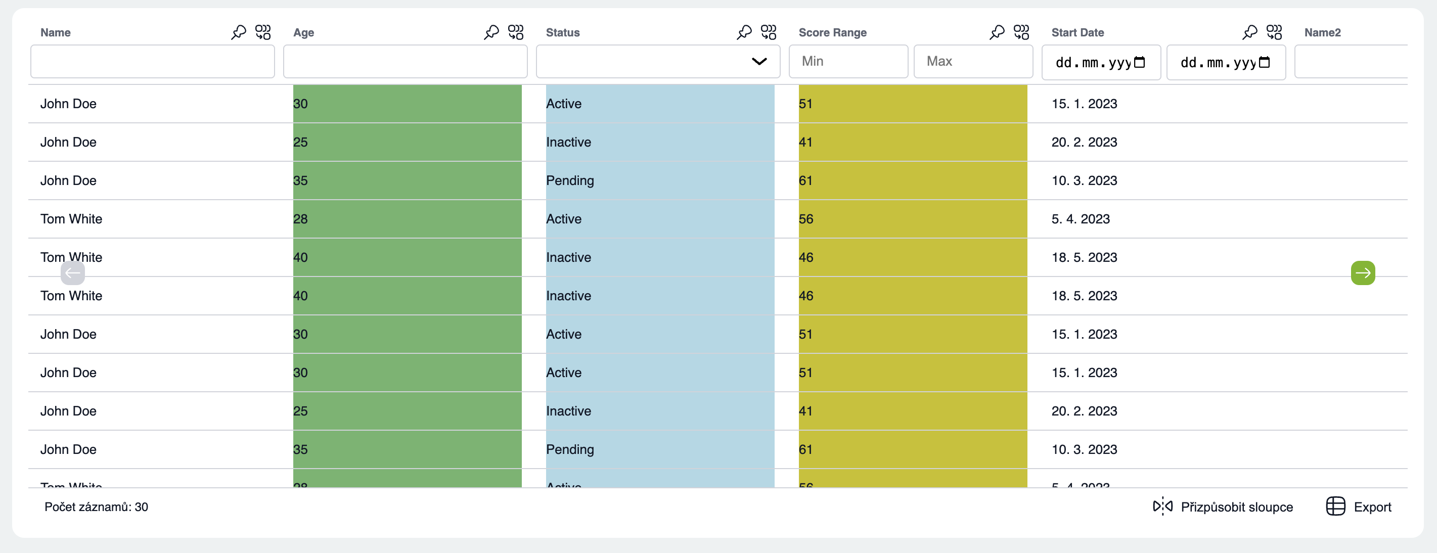
DataGrid Tanstack
The Tanstack DataGrid is designed to display large and small datasets from 1 - 300,000 rows. It includes advanced grouping, aggregation, filtering, sorting...
DataGridTanstackProps
Property | Type | Default | Description |
id | string | Table identifier | |
row | Array | Data | |
columns | Column[] | Table column definitions | |
isLoading | Boolean | false | loading status display |
enableRowVirtualization | Boolean | true | Performance optimization for rows, turn on for larger dataset rows > 50 |
enableColumnVirtualization | Boolean | false | Performance optimization for columns, turn on for larger datasets columns > 15 |
enableColumnPinning | Boolean | true | Enabling column pinning in a table, applies to the entire table. It is also possible to resolve this at the Column Props level |
enableGrouping | Boolean | true | Enabling grouping in a table, applies to the entire table. It is also possible to solve it at the Column Props level |
enableFiltering | Boolean | true | Enabling column filtering in a table, applies to the entire table. It is also possible to solve it at the Column Props level |
actionButtonsInMenu | Boolean | false | Displaying the grouping and pinning column button in the popover. |
exportData | Boolean | true | Permission to export to CSV and Excel |
columnDefaultSize | Number | undefined | undefined | Default column width, applies to the entire table. Can be resolved at the Column props level. If undefined, the CSS rule flex:1 is applied -> all columns of the same width stretched across the entire table |
columnDefaultMinSize | Number | 100 | Minimum column width for resizing, applies to the entire table. Can be resolved at the Column props level. |
columnDefaultMaxSize | Number | 500 | Maximum column width for resizing, applies to the entire table. Can be resolved at the Column props level. |
initialGroups | String[] | Default grouped skins | |
initialSorting | [{id: string, desc: boolean}] | Default column sorting | |
initialFiltering | {id: string, value: any}[] | Initial filter on first table rendering | |
initialColumnVisibility | {['column id']: true | false} | Hiding a column on first render | |
leftPinnedColumns | String[] | Default pinned columns on the left | |
columnGroupedColor | String | Changing the default color for grouped columns | |
rowAggregationColor | String | Changing the default color for column aggregation | |
dateFormat | 'dd.MM.yyyy' | 'dMyyyyy' | 'dd/mm/yyyy' | 'MM/dd/yyyy' | 'yyyy-MM-dd'; | Change the date display format for the column type: 'date'. If not set, the date format is according to the set language | |
userLang | "cs" | "en" | "de" | "sk"| "pl" | "en" | Component translation settings (does not apply to column names and table cell content) |
isLoading | Boolean | Loading state display | |
enableRowSelectionOnClick | Boolean | false | Enable row selection on click |
rowDensity | 'compact' | 'standard' | 'comfort' | 'standard' | Row height |
Column Props
Property | Type | Default | Description |
field | String | ||
type | 'string' | 'number' | 'date' | 'range' | 'select' | 'string' | Column type, based on the type the appropriate column filter will be displayed |
headerName | String | Column name | |
enableFilter | Boolean | true | Enable/disable column filtering, default enabled, must be enabled props on table enableFiltering |
columnAggregation | 'sum' | 'median' | 'min' | 'max' | Function applied when grouping a column | |
enableGrouping | Boolean | true | Enables cluster grouping, default enabled, must be enabled with props on the enableGrouping table |
size | Number | 250 | Default column width |
minSize | Number | 100 | Default min. column width |
maxSize | Number | 500 | Default max. column width |
cell | (cell: any) => any; | Modifying a cell value | |
accessorFn | (originalRow: any, index: number) => any; | combining values from multiple columns into one |
